

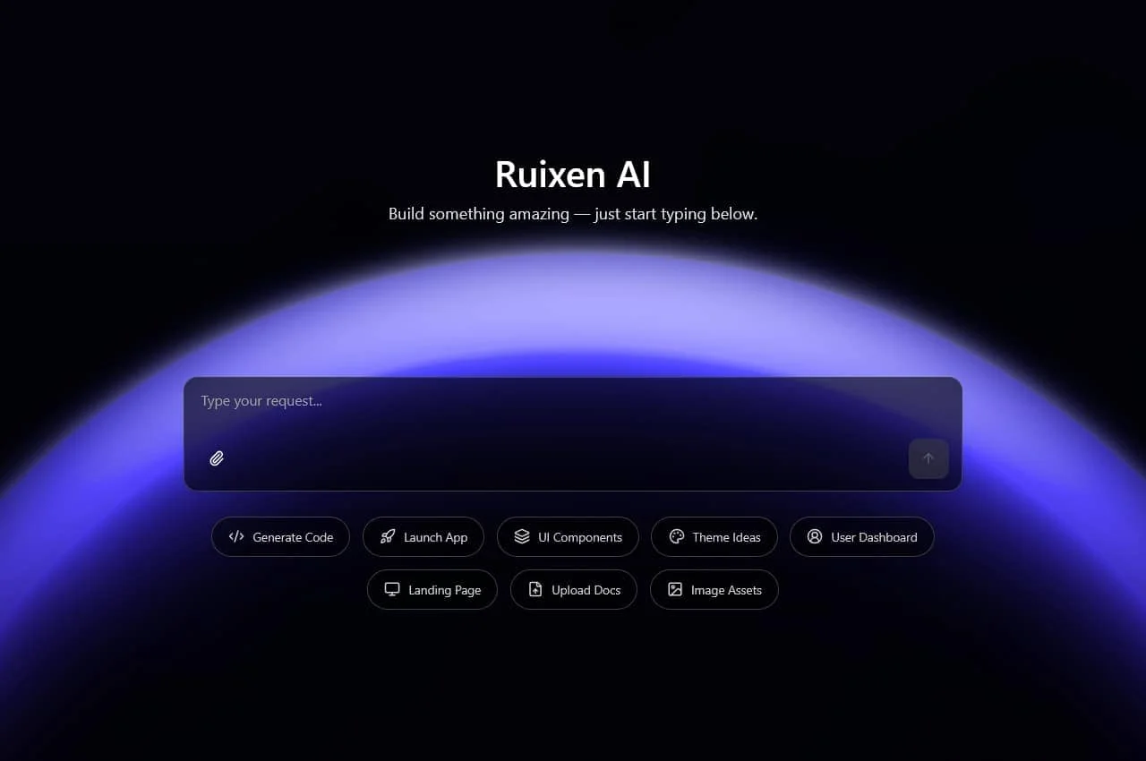
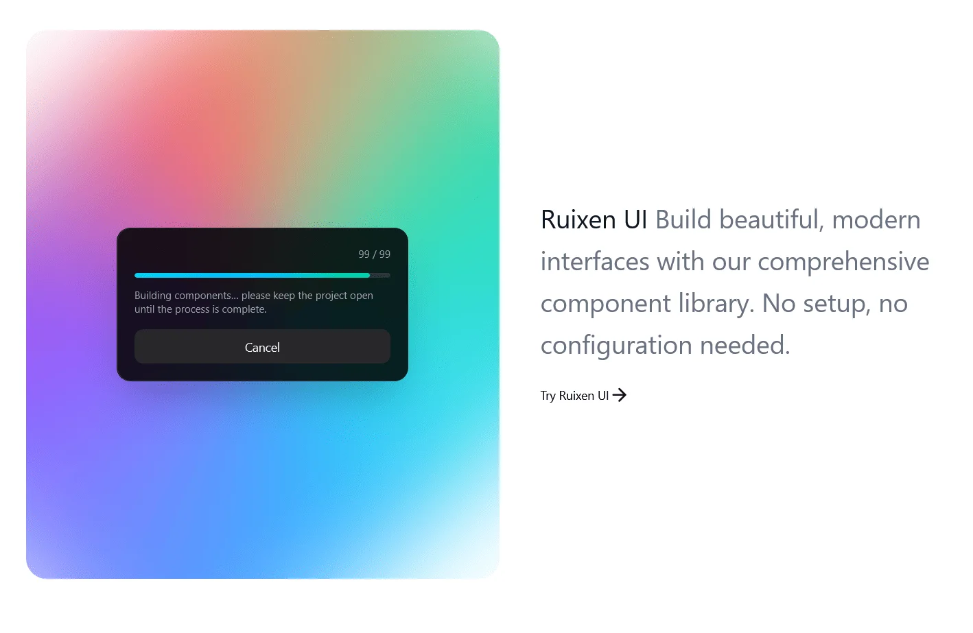
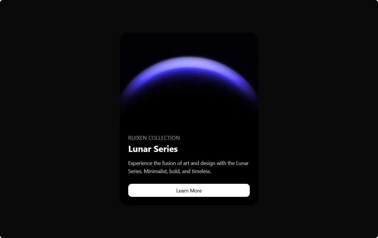
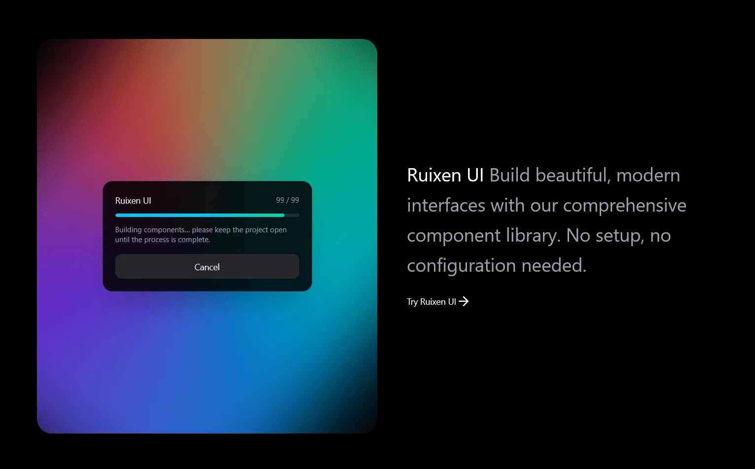
Ruixen UI: Lightweight & Customizable React Library
Ruixen UI is a modern, fast, and customizable React component library built with Tailwind CSS, TypeScript, and accessibility in mind.


Frequently Asked Questions
A practical guide to getting productive with Ruixen UI: components, theming, performance, accessibility, pricing, and integrations.
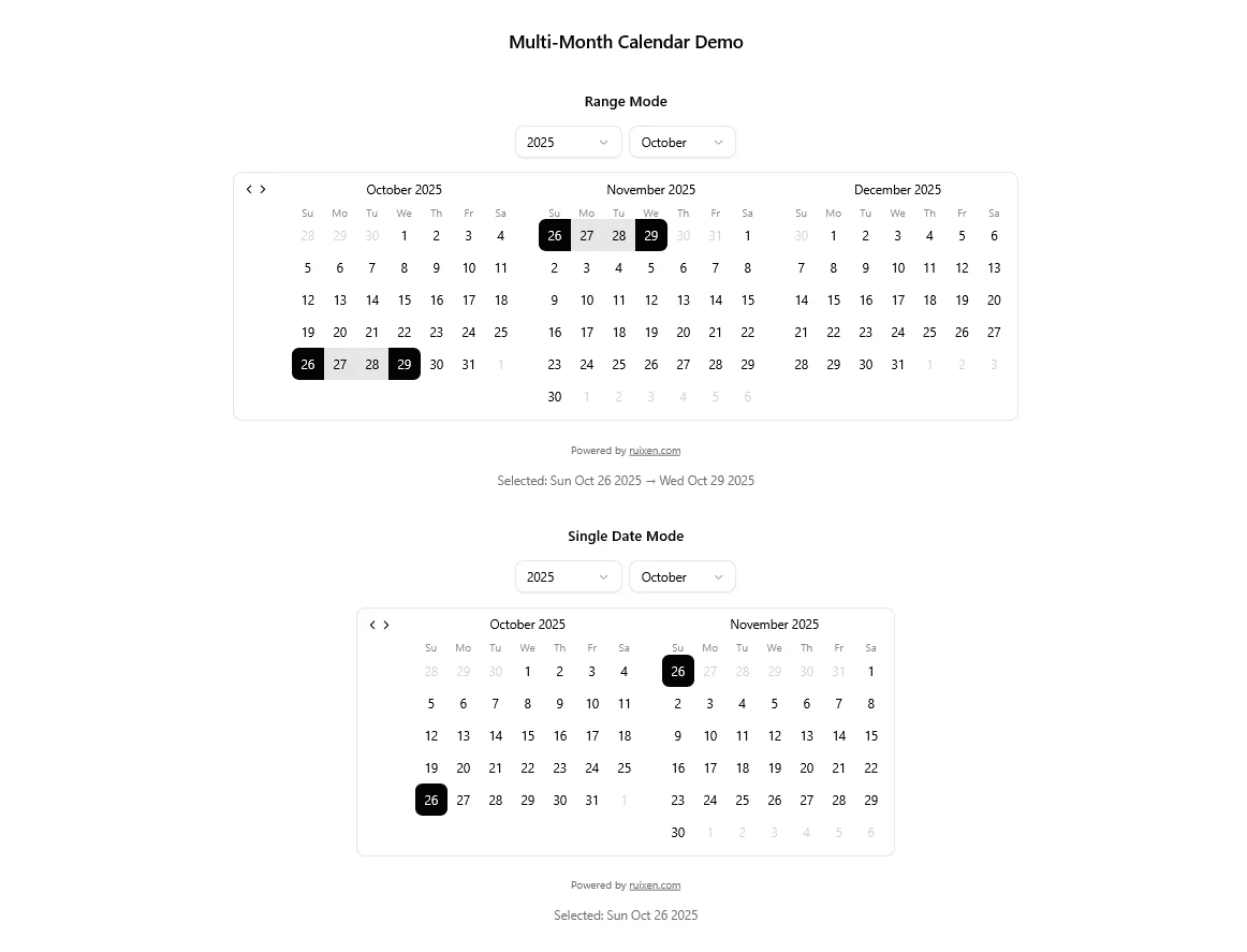
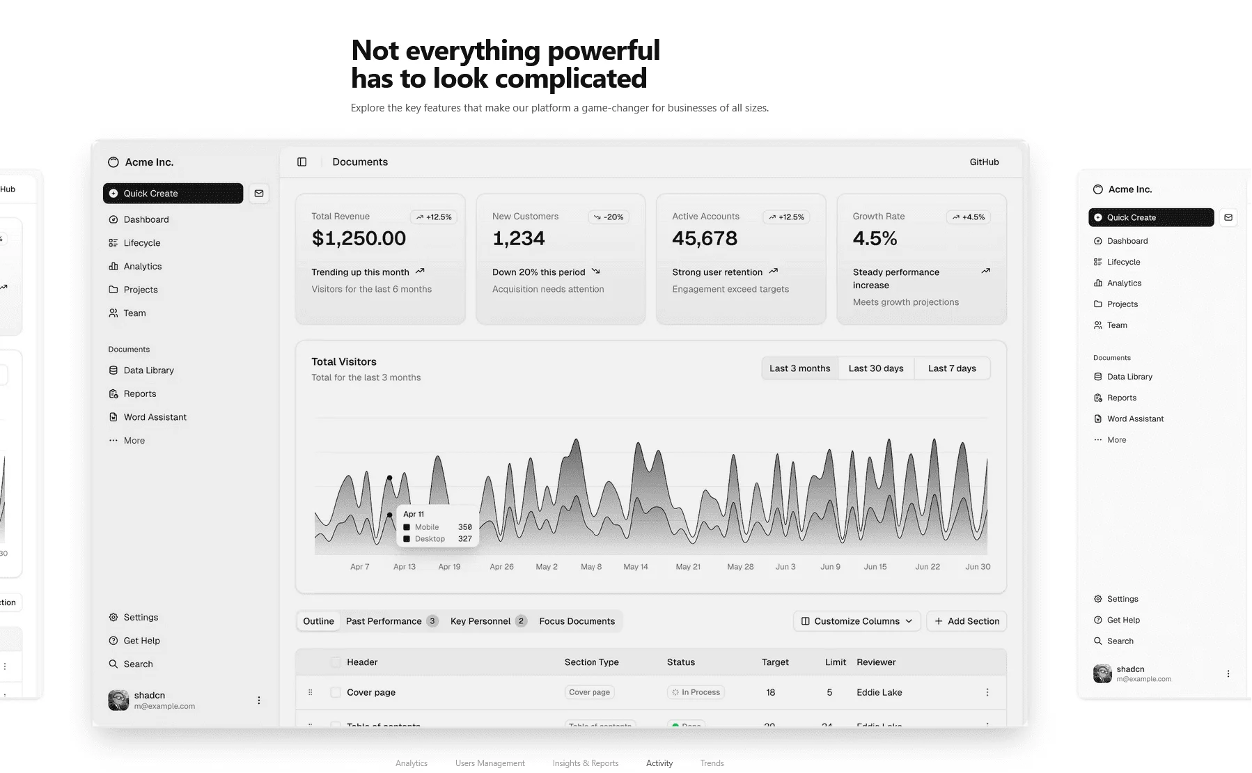
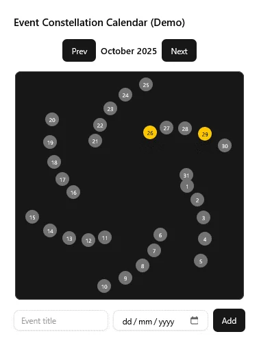
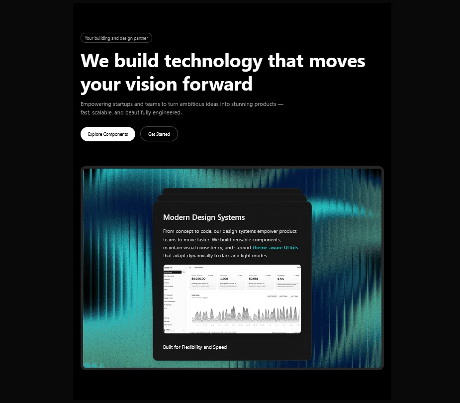
About Ruixen UI
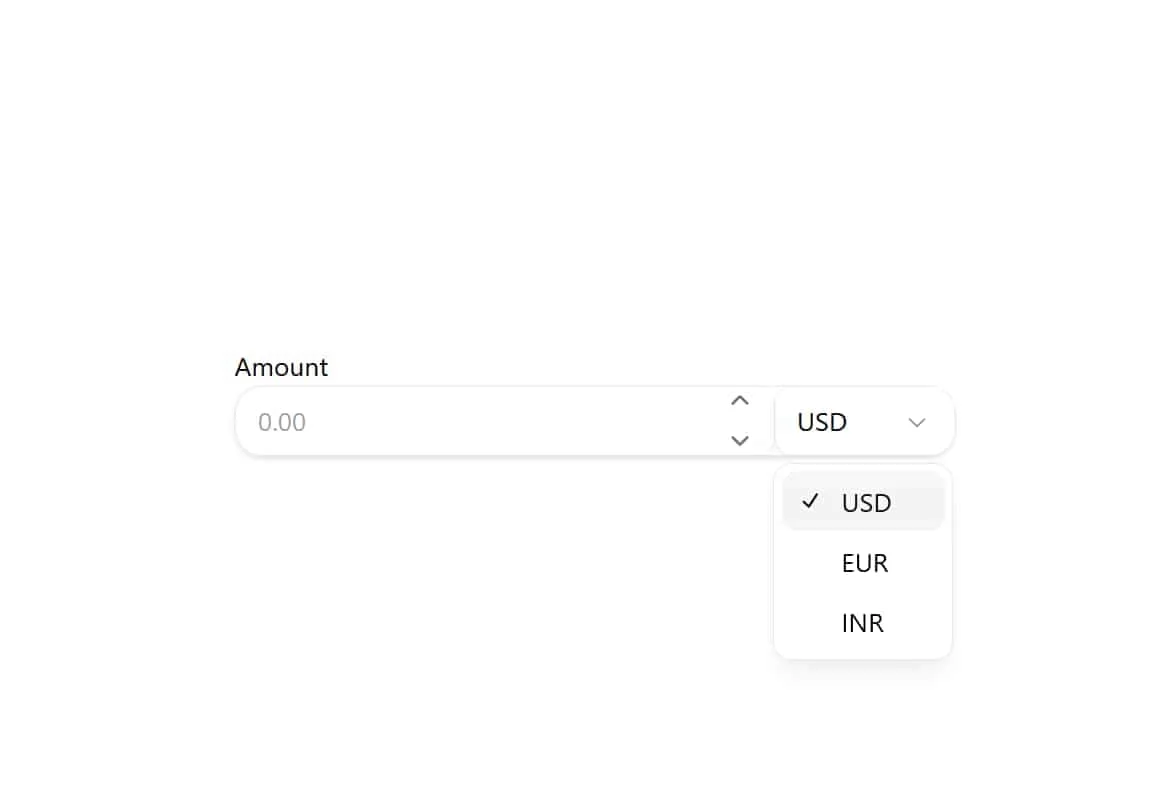
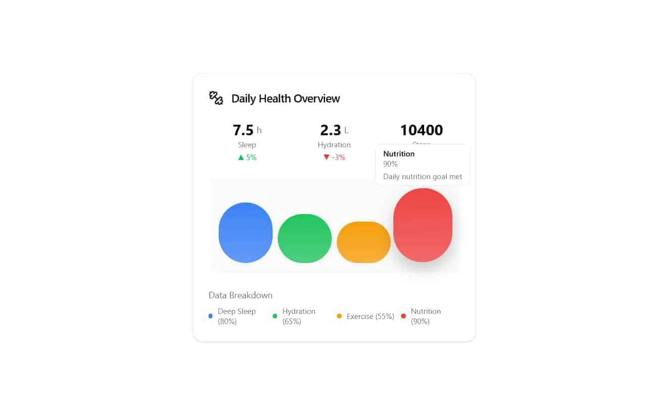
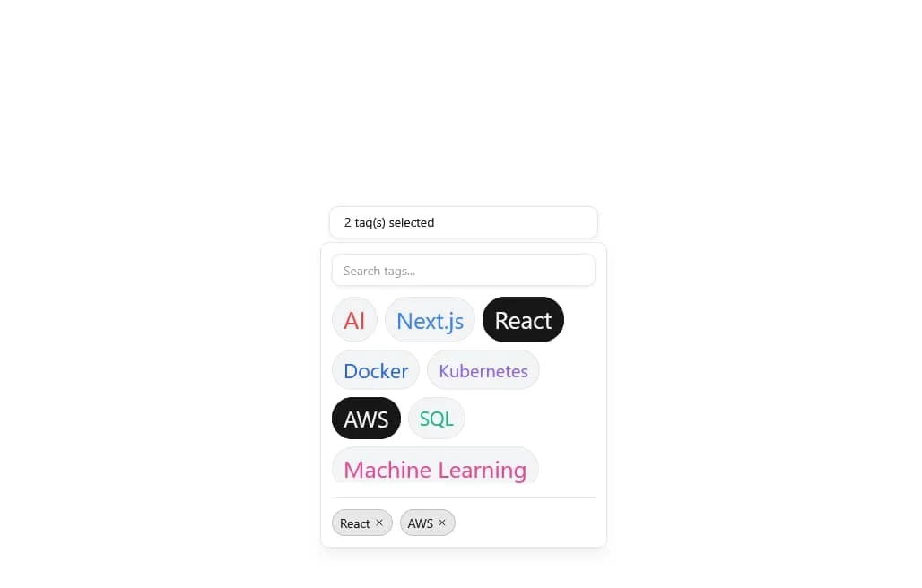
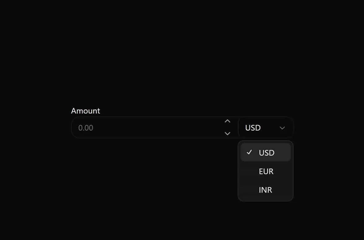
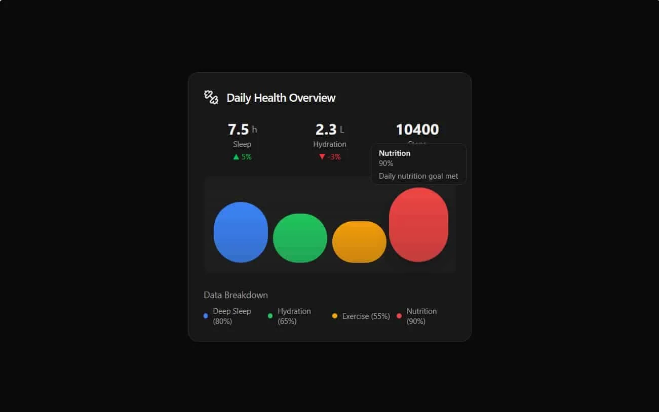
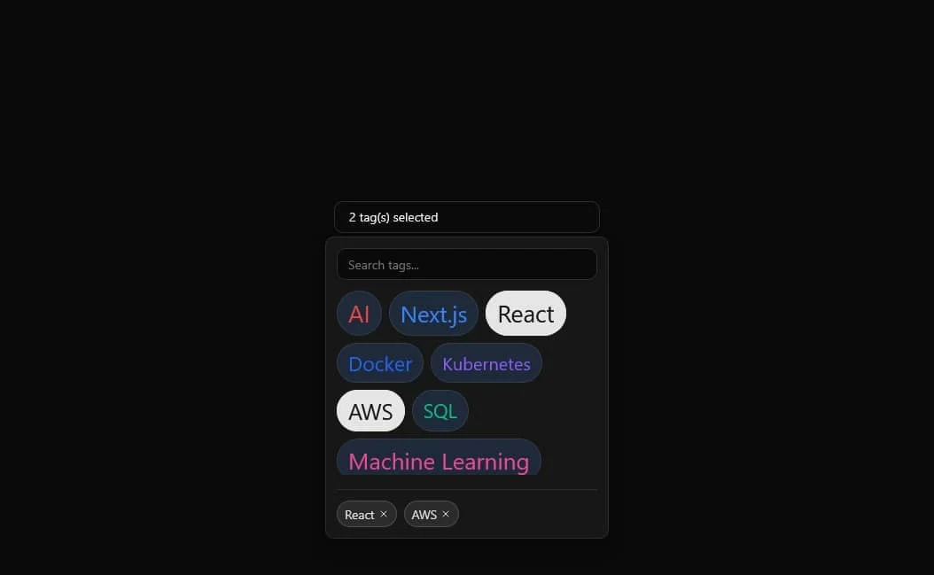
Ruixen UI is a production‑ready React component system designed for rapid app development. It pairs a modern design language with type‑safe APIs, keyboard‑first accessibility, and flexible theming. Whether you’re building dashboards, marketing sites, or SaaS admin tools, Ruixen UI helps teams ship consistent, high‑quality interfaces faster.
- DX you’ll enjoy: headless primitives, composable props, and predictable overrides.
- Design tokens & theming: switch light/dark, brand palettes, and radii in minutes.
- Accessibility: focus rings, ARIA, and reduced‑motion built in by default.
- Performance: tree‑shakeable, zero‑runtime CSS where possible, and minimal re‑renders.
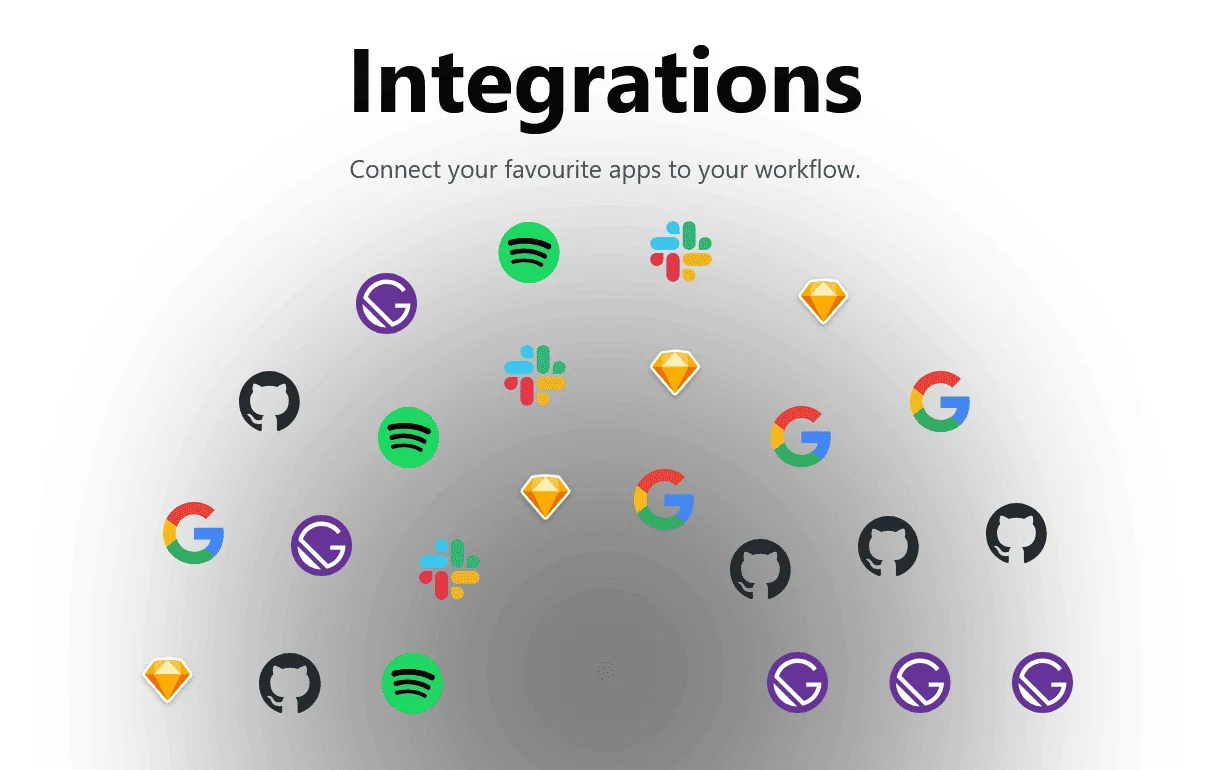
- Integration‑ready: works with Next.js, TanStack, React Hook Form, and more.
Can’t find what you need? Reach out to our Ruixen UI support team for assistance.
Can’t find what you need? Reach out to our Ruixen UI support team